Cincom Configurator "Cart" - Using B2C Patterns in B2B
An unmoderated usability study using low-fidelity prototypes to test using B2C concepts in a B2B workflow.
B2B
Prototyping
User Research

An unmoderated usability study using low-fidelity prototypes to test using B2C concepts in a B2B workflow.
B2B
Prototyping
User Research
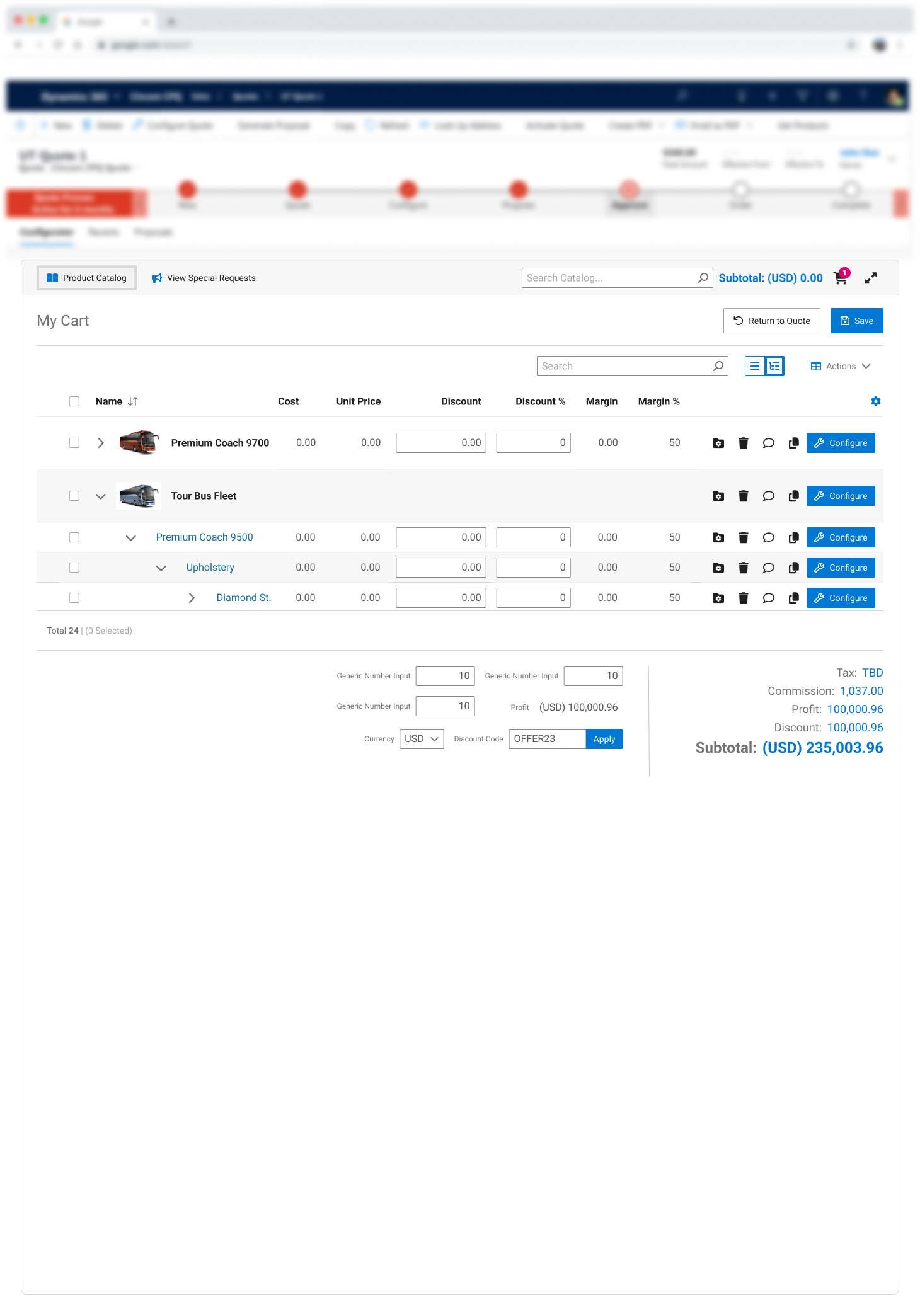
The goal for this study was to validate our assumptions that the concept of a shopping cart would make sense when embedded inside of a CRM solution. Our team also wanted to understand if leveraging common user experience patterns for shopping carts would be clear to users of CPQ solutions. In addition, we needed first-hand knowledge of how users would interact with the entire cart flow from the product catalog all the way to configuration and reconfiguration.
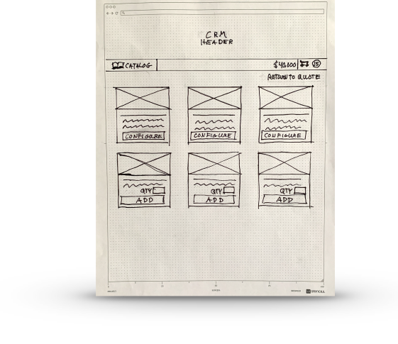
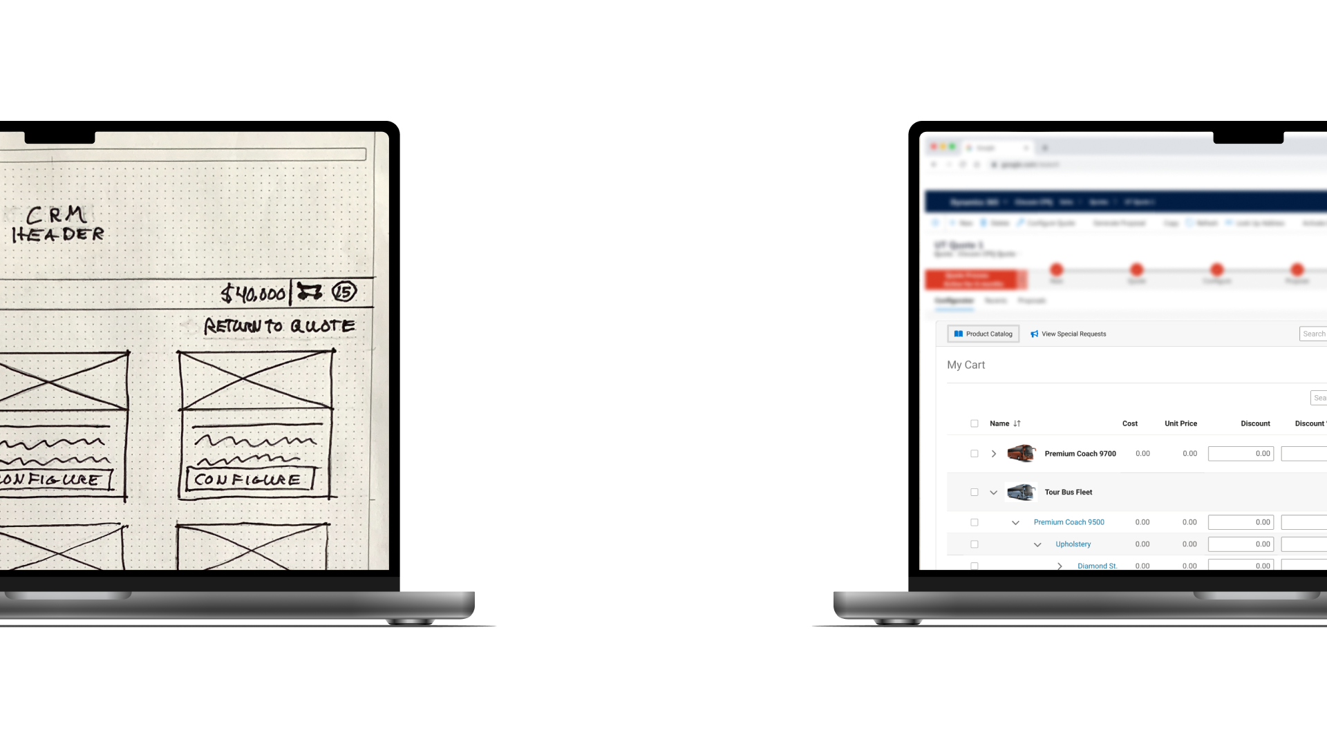
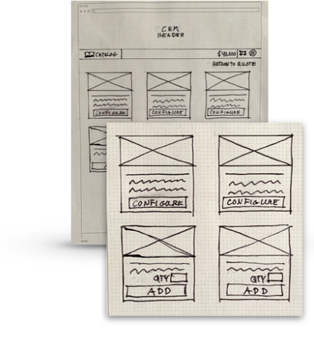
Our test included series of rapid prototypes created with pen and paper to allow users to provide focused feedback on the questions asked and not the aesthetic. Leveraging the UserTesting.com platform, we tested 5 users in sales who are familiar with configuration tools and CRM systems. We presented the users with a series of screens that a limited number clickable areas for them to interact with.
The tasks for this study were designed to provide insights to how effective the proposed cart interface is in getting users from point A to point B. During the recorded sessions, participants used a “think out loud” approach as they shared their thought process and worked through completing the following tasks.
As a sales representative, where would you go to understand how many products you have already configured?
The “BADGE” was clear to users to understand
The badge with the number of items a user had configured was clear. Users went directly to the badge next to the shopping cart icon. Other considerations:
Where would you go to change the configuration of an item you have already put together for a customer?
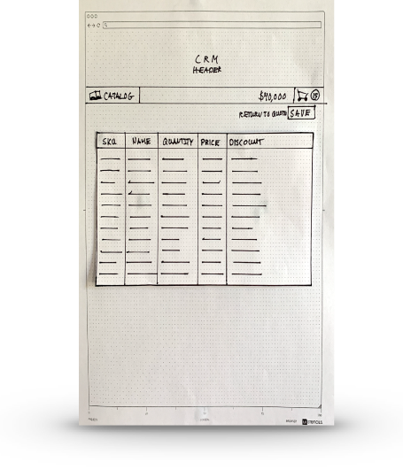
The Majority of Users went to the cart WITHOUT QUESTION
Only one user really questioned if they should go to the cart. Overall this met our expectations. Users were first presented the catalog screen then they all clicked the cart icon to navigate to the screen shown here.
How would you approach narrowing down the items displayed while building a configuration?
When present, searching within context was clear but some bypassed it
In some cases, users expected the selections themselves to narrow down the items displayed which. However, when presented with the search within the context, they also looked toward using this as well. Perhaps it was working of the question, but some of them mentioned the word “filter”
From the same screen, how would you find items in product catalog?
Most users clicked the catalog link but also desired to Search
Users went to the catalog link instinctly as “catalog” was mentioned in the question. Most also mentioned a desire to search in the catalog from the top bar. All users felt they did this task successfully.
From the same screen, how would you find items within context of "delivery van" such as "fuel?"
In context search was clear to users
All users went to the search box to filter within the context of “delivery van.” This validated the need for some level of search within the interface.
Based on what you see in the interface, how clear would it be to narrow down/isolate items that have to do with "color."
In context search for additional items was also clear to users
In general users used the search box to filter within the context of “deliver van.” However, users in this case one use also would have used selections to narrow down their items as well.
For this task, start by not clicking anything. From the catalog screen, what would you expect to happen when entering a quantity and clicking “add?”
Clicking add for pre-configured would increment the cart number
All users expected the quantity in the cart to increase. We would assume this would mean the user would see the badge next to the cart to increment up. Allowing them to quickly add and then adjust details in the cart later.
How would you add another product once you completed your current configuration?
Users instinctly went to the catalog
Users went back to the catalog menu item to add more products but did not think of search when not displayed in this section of the test.
From the same screen, how would you find items in product catalog?
Users gravitated toward the catalog menu item
When not shown the search bars the catalog menu item was obvious. Users did not mention us omitting the search in this section.
From the same screen, how would you find items within context of "delivery van" such as "fuel?"
When search was missing users found creative ways to find what they needed
When users were asked similar questions as before they desired a search but also thought of ways they could find information by narrowing down selections.
Based on what you see in the interface, how clear would it be to narrow down/isolate items that have to do with "color."
When search was missing users found creative ways to find what they needed
When users were asked similar questions as before they desired a search but also thought of ways they could find information by narrowing down selections.
The concept of “cart” tested well overall as did the concept of searching within context of a configuration. Users were able to understand where to find previously configured items and how to add new items to their quote both from the catalog and the cart itself. Users were presented both a catalog and an in context search options but only missed searching in context of the configuration when both were removed. It should be noted that both search options being presented at the same time seemed to not be overwhelming to users.
Based on what was tested, this functionality appears to validate the assumptions of the business that the cart concept would work but we need to be cautious of how we implement searching even though this portion tested well. We also should consider providing visual cues when items are added to the cart vs. taking them directly to the cart. In addition, we also should consider visual indicators/messaging when users leave a configuration before completing it.
Future testing may need to be conducted to validate messaging for when leaving a configuration mid-stream which was a realization we had while observing users go through the interface. We also may want to introduce more negative testing and remove elements to make sure users miss elements that we assume are key but may not be as important to them.